Monday, November 30, 2015
Scratch Game Design
Coding is very hard. Coding is very very hard. I have created a game from "Scratch" though, in "Scratch". Now I'm not saying my game is going to be the next Mario. I personally like my game even though it has a lot of bugs. I just couldn't figure out how to get the frogs to stop moving when the knight did. Not a lot of people played my game to give me feedback to improve. I tried to make it like a game where you had to chase a bunch of frogs running away, so that's why their movements are random. Their movements aren't random though. They move according to how you move the knight, but they don't all move the same way.
I definitely got better at coding the second time. I don't know everything there is to know about code, but I did get better. Now I actually know what most of the blocks do, achievement accomplished! I still have some bugs in my second game, like how you automatically lose sometimes when you start. I just figured out you can just press the flag twice though. I haven't yet figured out how to fix it, but I probably will... Eventually. Also, you might have noticed that after you lose all of the characters stop. Unlike my first game. I also have a preset timer in the first game, but a variable timer in the second. For those of you who have no clue of what I'm talking about here is a link to help you.
The best code I wrote was the crabs code in the second game. His code is all one giant block, with C Blocks inside of C Blocks inside of more code and more code. The last part of the code, with the purple and yellow blocks repeating, is my party room. You can get there by beating the bonus level of my game. How I made it was I had a lot of different backgrounds, that are filled with only one color, and switching them every 0.01 seconds. I still have some pretty big bugs I still need to fix, but I had a lot more than I had before. I overcame my most difficult bug fixes by asking the people around me. I mainly just viewed other peoples games in progress and if I saw something that I could incorporate in my game I asked them how they did it.
Invention Commercial
P1T4_Invention from Kapaa Middle School MEDIA on Vimeo
We finished our invention idea! In my opinion our main goal was just to make a great, funny commercial. I think we did pretty good, and in the end we got class best! Our entertainment factor was off the charts and everything else was good as well. When we first started our project we knew what we were going to do, but not how to make it. Also, we only had about one and a half weeks to complete this project, so we filmed it over the weekend. I was personally getting anxious when other teams were half way done with their filming in school and we hadn't started. In the end though we pulled through and won best in class by a landslide!
During the editing stage of this project Raiden and I did the main editing, while Preston searched for a song. Editing wasn't too hard for us. It only took about two class periods for us to get this all done and exported. I thank the plan for that, without it we would have to figure out where everything went. I guess Mr. Sanderl was right, the plan actually does help you. Preston was searching up the song for the team because in our very beginning shot, which we didn't add in, Preston was singing the song that you can find in our video. At first we were thinking of just leaving Preston's "amazing" singing voice in, but then we found the actual song. There wasn't much to do after that other than place the clips into the right place and add some voice-overs if needed. Raiden and I placed the song as well, but it didn't take very long. We didn't use any sound effects from iMovie so it was easier on our part.
Thursday, November 5, 2015
Composition Scavenger Hunt
P1T4_Composition_2015 from Kapaa Middle School MEDIA on Vimeo.
The more random votes the worse |
The most difficult composition technique, in my opinion, is ants eye. I think that is the most difficult technique because it's just so hard to get that low on the ground to make it just low enough so it's not a low angle, and angled just right to not make it a ground angle. I think ants eye can be used more because it is an unusual angle. The film producers use unusual angle all the time because it keeps the audience's' attention.
My team was made up of Raiden, Preston and I. In our composition technique video we all did everything. For example you see everyone at least once in our video. You can hear all of our voices as well. Some people did more than others though, like how you saw me in most of the shots. Anyway, since we all did everything we all did editing. Preston did the main editing, getting all of the shots on the board, Raiden labeled the shots on which composition techniques were showing and I did the transitions. The project was pretty easy overall, it took us about 2-3 days to complete it and if you're a film maker out there you know that's nothing. Well, that's all for know folks!
Thursday, October 22, 2015
Cracking the Code
I think everyone should learn to code at least once in their life. You don't have to learn code as of now but it would benefit you a lot in life. Now that the world is revolving, and technology is advancing, we need to learn about the new world so we don't get left in the dust. More and more jobs are involving coding and computers, and anyone who doesn't know how to operate a computer will be left without a job not knowing what to do. There is this really cool coding program our teacher showed us, and at the very end you get a special certificate and a basic knowledge on coding. The program is basically a game and it's really fun! Can you crack the code in less than an hour?
I aways liked coding, I found it to be a language within its own that you could use any language to access. My first experience with code was last year in my science teacher Ms. Bandsma's class. It was the same program as this class and another one called code combat. I thought it was really fun because we got to play around in the class and have a great time! At first it was difficult because at the time I couldn't think outside the box as well as I can now.
If I could design any program or game I would get really creative. First of all, I would want it to be an app because then people could play it anywhere. I would base it off a game game called Anger of Stick. In my game you would be a stick figure running. I'm so original right? In my game, though, you could run, walk, slide, jump, punch, pick up weapons and use them. The plot behind it is you are a spy during World War 2 and you were captured, but you escaped, and you want to get back home. Soldiers are firing guns at you and you have to jump and slide to dodge them. You have a hunger bar so sometimes you would have to walk to regain hunger. I think I want my game to be leveled, so there would be fifty levels (one for each state in the United States) continuously getting harder. All in all I just really think it would be fun just to design a game! Leave a comment below and tell me what game you would design and check out my classmates blogs and see what they said!
Thursday, October 1, 2015
My Humorous Monologue
WeinerH_Comedy from Kapaa Middle School MEDIA on Vimeo.
These were the results for my video |
Here are the project requirements!!! |
Yes!! 4/4 |
Thursday, September 17, 2015
Comedy Writing
We now have to make a comedic monologue in our class, but first let me tell you what a sense of humor is. A sense of humor, in my opinion, is the most important character trait. Whenever you are feeling down and someone tells you a funny joke, you just can't help but start laughing. A laugh can bond together random strangers, or lighten the mood in a really tense situation. If we didn't have a sense of humor as people then, yes we would work a lot more efficient, but we wouldn't know how to enjoy ourselves. We wouldn't know how to have fun and "joke around", literally. Well I guess if you were born into that world you wouldn't know about laughter or humor, unless you were in one of those movies where you were traveling through different dimensions. Then, you would have to find a world with humor and laughter. Anyway, it would just be depressing if you were born into a world without laughter.
Five tips for writing a humorous narrative are, creating original jokes, choosing the right expression for the joke, timing, how you tell it and being yourself. Creating original jokes is the best tip someone could give you because you never ever want to tell a joke that's already been told. Choosing the right expression can get difficult at some jokes so establish the mood first, then make a funny face relating to the jokes mood. Timing can also be difficult, but just try to string up jokes that have something in common. You can also tell the joke in a funny voice to make it go from funny to hilarious! Lastly, just be yourself because no one likes a try hard in general, but if you don't try it all the joke might fall short.
My comedic monologue ranges from bad puns, to "sophisticated" jokes. My monologue is all about an everyday life of something, whether it be man, muffin, baseball or baseball mitt. In this project you could choose whether you did a whole comedic story or a lot of little one liner. As you can see I went for the one liners, mainly because I have no good stories to tell. If you do comment down below, I'm always in the mood for a good laugh. Here is my monologue!:
Doesn’t everyone love computers, hackable, glitchy, ruin your eyes computers?
I never got why everyone in middle school needs a boyfriend/girlfriend. (Really shocked/annoying voice) Wow I want someone to stare at and not say anything to as well!
You know what really bugs me? Misleading titles. “Hey look there’s an article in the newspaper titled bugs endangered! Wait this article is only about technology starting to get rid of errors.”
and what is it about people always saying “oh you’re so cute” or “oh my god look how handsome you are”, yeah this is my natural state, I already know I’m beautiful
Five tips for writing a humorous narrative are, creating original jokes, choosing the right expression for the joke, timing, how you tell it and being yourself. Creating original jokes is the best tip someone could give you because you never ever want to tell a joke that's already been told. Choosing the right expression can get difficult at some jokes so establish the mood first, then make a funny face relating to the jokes mood. Timing can also be difficult, but just try to string up jokes that have something in common. You can also tell the joke in a funny voice to make it go from funny to hilarious! Lastly, just be yourself because no one likes a try hard in general, but if you don't try it all the joke might fall short.
My comedic monologue ranges from bad puns, to "sophisticated" jokes. My monologue is all about an everyday life of something, whether it be man, muffin, baseball or baseball mitt. In this project you could choose whether you did a whole comedic story or a lot of little one liner. As you can see I went for the one liners, mainly because I have no good stories to tell. If you do comment down below, I'm always in the mood for a good laugh. Here is my monologue!:
So, one day I met two muffins who were best friends, they could talk to each other, and they agreed with each other! So one day they were hungry and the first muffin said “I’m hungry where should we eat?” and the second muffin said “I know, Starbucks!” So, they were eating at starbucks and the first muffin said “mmmm this is delicious what is it?” The next muffin said “I don’t know, but it kind of looks like… YOUR BROTHER!!” *Gasp*
Doesn’t everyone love computers, hackable, glitchy, ruin your eyes computers?
I never got why everyone in middle school needs a boyfriend/girlfriend. (Really shocked/annoying voice) Wow I want someone to stare at and not say anything to as well!
I also never got why people like to eat junk food. You know the kind of food that makes you sick, and unhealthy, (starting to drift off) the kind of food that is tasty, and flavorful and convenient and… (Snaps out of it) Huh I’m kind of hungry. Eh I’ll just have some potato chips.
You know what really bugs me? Misleading titles. “Hey look there’s an article in the newspaper titled bugs endangered! Wait this article is only about technology starting to get rid of errors.”
and what is it about people always saying “oh you’re so cute” or “oh my god look how handsome you are”, yeah this is my natural state, I already know I’m beautiful
What did the mitt say to the baseball “Catch ya later”
I think my jokes are funny because I based them on reality. Okay, maybe not all of them are from reality. I still based most of them though, and most, if not all of them are relatable to you. Yes reader you. Take a look at them and see.
Wednesday, September 2, 2015
Motivational Poster
The expectations of our motivational poster are four images. Three of them are symbolic images that represent you in some way, and the other one is a picture of your face. We also need our manifesto in our poster and our personal quotes. Our text should also be kerned to make it so that there are no spaced without text. We also need a Triadic Color Scheme which is one color with two other harmonious colors on the color wheel, to make the image more visually pleasing. Last but not least we need Blending options and Adjustment layers. We basically need to adjust some of the setting to our text, make an outer glow, bevel and emboss, drop shadow etc.
I did my whole poster just using photoshop. Don't get me wrong though photoshop isn't easy, but it has a lot of power if you use it right. What I did was, take all of my photos ( the three symbols and my portrait) and put them underneath my manifesto and quotes. Then I kerned my text, and picked my triadic color scheme. I used some layer adjustments and color balances in order to turn my pictures a different color to match my color scheme. I then, changed the opacity of my text so you could see the images with my text.
My biggest challenge in this project was definitely kerning the text to make it fit the page. At first I didn't know that your text had to cover the page, I thought that you had to leave room for your images to fit in. I forgot that we could turn down tho opacity to make the text see through, but hey, this is only the beginning of the year so don't blame me. I think I could improve by listening to the teacher a bit better. Also, by asking the teacher what to do, when I need help with the project. I don't think I did so bad though, I got a 3/4, which means I only missed one thing.
Thursday, August 20, 2015
Personal Manifesto
Hey guys, long time no see. Five interesting facts about myself, is that I love to run around a lot. I also play a game called Magic The Gathering, which is a very cool card game. I am part of our schools morning news team and I like to read. My favorite color is blue and I like to eat food. I am also a twin. I am really not an interesting person as you can see. I don't know why teachers always tell you to write about something interesting, there is almost nothing interesting in a teenagers life.
Our new project is a manifesto which is when someone declares what they are going to do or believe in, in a certain time period. My manifesto is "You can do it. Live life to the fullest and don't let it go. Go to work and make it work. Cease the opportunity, and make the best of the moment. Do what you can and forget what you can't. Don't get down on the things that get you down. Get up on the things that get you up. Have dreams. Make them happen. Do good on tests. Try hard. Be a role model. Turn school into summer. Turn around and try a new way. You may like it. You may not. A bad truth is a lie. Take chances, do it well, make it great, do it again." So, it doesn't matter how old or young you are, anyone can make a manifesto! It could take you years and years or 5 minutes.
My manifesto applies to my readers because everyone needs to step up and take a chance in life. Everyone needs a moment where they can shine, and not get overshadowed by someone else, that's why people need to step up in life. That is what I wanted my manifesto to be about. Taking a chance, and if it doesn't go your way then oh well, try again next time. As well as when it does go your way, then you know that you can do it and attempt it another time. So, the next time opportunity comes your way what are you going to do? "Cease the moment" or back down and cower away. (Oh no, sorry I just realized I used the wrong seize. Instead of seize I put cease, gosh dang it homophones.)
Our new project is a manifesto which is when someone declares what they are going to do or believe in, in a certain time period. My manifesto is "You can do it. Live life to the fullest and don't let it go. Go to work and make it work. Cease the opportunity, and make the best of the moment. Do what you can and forget what you can't. Don't get down on the things that get you down. Get up on the things that get you up. Have dreams. Make them happen. Do good on tests. Try hard. Be a role model. Turn school into summer. Turn around and try a new way. You may like it. You may not. A bad truth is a lie. Take chances, do it well, make it great, do it again." So, it doesn't matter how old or young you are, anyone can make a manifesto! It could take you years and years or 5 minutes.
Wednesday, June 3, 2015
Music Videos Rock
P5T1 Centuries from Kapaa Middle School MEDIA on Vimeo.
The next project we are working on are music videos. On my team are Preston, Kynan and Tim. We were all assigned jobs by our director/ leader Preston. I got the job as the camera man since I was the most experienced with the camera. Tim got the job of Tripod Man which means he set up the tripod. Kynan is the main character in our story and he carries all the equipment there and back. Our story is about Kynan being bullied, and being the guy that nobody wants to hang around with. He goes up to a group of kids, Preston, Tim and I, and we say he can't hang out with us. Then we accept him and allow him in our group.
I think the audience will enjoy the resolution in our story the most. The resolution in our story us accepting him in our group. I think that the audience will enjoy this the most because it has the most symbols about being friends and being appreciated. After all the Kynan goes through he finally gets into our group. Wait no, this just in, I have now been "promoted" to the kid being bullied because Kynan wasn't there one of the days we needed to film, so we changed our story to make me the bullied one. Anyway I am now getting bullied and I get accepted into Preston and Tim's group.
Our music video shows what we have learned this year because we've showed interesting angles and we did Photoshop. Kynan and Tim did the Photoshop picture while Preston and I were doing the editing. We had put a lot of time editing and cut all of the scenes into smaller segments, because our teacher had told us that we could have 5-2 second scenes. The Photoshop editing was not very hard, but someone had deleted all of our pictures except for the one we needed, but we needed two different pictures. So, we improvised by taking a screenshot of one of our video clips and used that.We would have done an animation but nobody wanted to and we had to little time.
Here are the results. |
Thursday, May 7, 2015
Lyrical Livelihood
Personally my favorite song is demons by Imagine Dragons. These lyrics make me feel connected to everyone because in truth everyone has a dark side. Everyone has that little devil on their shoulder, and evil side to them. It just makes us all together. Some people can fight their inner demon more than others, and at some point those people have difficulty fighting their demon. The demon never goes away and he is always there, and that song shows it. It shows that someone is having trouble with their monster inside them and is attempting to fight it.
The song my team chose to work on is the song Centuries. My teammates are Kynan, Preston and Tim. We picked it because it was a very catchy tune and it was the only one we could agree on. At first I wanted to do a tiny tim song, which two of my other teammates have heard of. Except one of my teammates didn't want to do it, but the other one who had not heard of it was okay with it. Our teacher said that all teammates had to agree on a song so we couldn't do that. So, we ended up doing Centuries, which everyone had heard of and was good with. All I am trying to say is that no one could decide on a song so we just all went with what preston had suggested on.
The visual story our music video will tell is about someone who is bullied and beaten up, and who nobody likes. He then walks up to a group of the cool kids and says hey can I be in your group? At first they reject him but then one of the members say that they should allow him in their group. This story tells us that even if you think you are a reject, and nobody likes you, you still have to try to make friends and eventually you will succeed. This relates to our audience because everyone had that moment when they had no friends at all. This is just to say that you need to try. The performer of this music video is Fall Out Boy.
Friday, April 24, 2015
Our Animation Story
Our focus statement tells our story because it is about how Kynan is afraid of everything, especially death, and meets up with death in his dream and the nay way to stop the out of control plane is to beat death in a game of chess. This story is completely made up and is not true, but has a deeper meaning to it than just playing chess to save lives. That meaning is to stand up for yourself and others around you, that are either stranger or family. My group chose this because everyone has that moment that will either make or break them and sometimes you have to do the right thing even though it would be much easier to just let go. The moral of this paragraph is, to never give up, and don't let it go. (haha Frozen references)
Our audience will learn about how it is never good to give up. As in my last paragraph I said that even if you are scared then you still can do it, it just takes a little more effort, and a bit more encouragement. Our audience will learn this by seeing our story and saying "even though Kynan was scared of... Everything, he still pulled through in the end and saved the plane. I think it is important for everyone to know this lesson because I think now people are starting to get dependent on machinery and technology. Even though we think were all strong and mighty and the superior species, some of us would not last a day without technology. Within a month all of us who use technology would go mad. Our story teaches us about how we can pull through if we can do it mentally.
My best moment as a team would probably be just hanging out having fun, and shooting stop motion. Overall it was just a fun experience to have a tiny bit of stress to work my butt of and try to come out with the best quality my team and I could produce. The worst moment would probably be geared toward the end of our project because we were all doing our own separate thing and we didn't communicate a s well as we did before. Sometimes we would start scenes someone else had already be working on, and sometimes somebody would come in at lunch, leave and then the other people come in right after they left. Now that I look at that scenario it is actually really funny, but when it happened it was so annoying. Anyway wish us luck on our project. Peace out.
Oh wait stay, never mind, look at my amazing animation video at the top of the page. Ok, now peace out.
Animation Outtakes
We are starting our animation process again this year! Except this time I actually know what I am doing. Now I love animations, especially creating them, they just look really cool. My teammates for this project are Kynan Ledee, Mason Doo and Kamalei Berg. Now here are some interesting facts about my teammates. Did you know Kynans favorite food is Pizza? Also he likes TACOS! Did you know, for some strange reason, Mason and Kamalei are mistaken for each other? As well as sometimes Kamalei likes to Bogey board. Mason (or Kamalei I DON'T KNOW) is in boy scouts and likes to read specific books.
Stop-Motion is when you look like your moving but really it is just a strand of pictures hung together. For example if you take a picture of someone taking a step, then another picture of them moving slightly, then another picture, then another, then another until you have a man moving without video! A GIF is a video just playing in a loop. Usually GIF's are about one to five minutes long and just keeps on playing over and over again. That's what a loop is, a video just playing over and over.
We are telling Kynan's story for our animation. Well kind of Kynan's story. We warped it so that it is more interesting, but it is based off of Kynan getting on an airplane for the first time. He falls into a deep sleep when his plane is out of control and falling fast! Except in his dream he meets up with death or Kamalei and gets challenged to a duel in chess. All of this is just to say that even if things get hard you still need to keep trying. Even if you are afraid of everything like Kynan, not really but, still do it!
ANIMATIONS ARE AWESOME |
Friday, March 13, 2015
Typography Images
Typography is a way of arranging text. That means in Typography Portraits you arrange words inside of a portrait. If you don't know what a portrait is you can look on my last blog post the Double Exposed Portraits. Typography Portraits are basically words inside of a picture, no meaning right? No the words inside of the image describes them, it tells everyone who looks at it look this is who they are. It can be used with images to make a lasting impact in, like I said, a typography portrait. How a typography portrait makes a lasting impact is you look at the image, but the image is made of words! So you pay attention to the image made of words, and it tells you what the person is, what they do, what they like and so forth.
My biggest challenge during this project was cropping and trying to get the text to fit. The first time I did this I was new and I was still learning. Now I have had experience and know what I am doing. The text was a big issue for me because I had to remove some spaces from the text and it was when I was almost done. So, I had to restart the whole process and remove the space. Also when I cropped the images I couldn't get the whole face inside the crop. It turned out looking like sides of his face got cut off . This problem sadly I did not fix, the crop box couldn't be fixed.
Right now I am writing about my three images, although I currently only have two at the moment. My first image is of Nikola Tesla the first person to come up with the idea of powering things with electricity. Yes that was not Thomas Edison that was, in fact, Nikola Tesla. I chose that image because I think that he is under appreciated. The second image is of my social studies teacher. This process was under the intermediate category so it was much harder to do and understand. The third image I am going to do is of myself (this is going under expert so it will be very difficult, wish me luck!). I had to rush on the last one so it will look hurried. The last one doesn't even look like me. :(
Wednesday, February 25, 2015
Double Exposed Portraits
Portrait photography is a picture of someone or a group of people that displays expression or mood. Usually the picture is focused on the persons head but it may have the persons body and a background image included. A profile is an outline of something, usually a persons face. Portrait and profile are similar because they both are of people, while one is of the side of the face and the other is of the whole face. Silhouetting is a picture of a person or an animal but it is only in one color. All these are very similar and yet so different, for example silhouetting is of a person but only in one color, a portrait is of a person or group of people showing mood or expression and profile is of the side of a persons face.
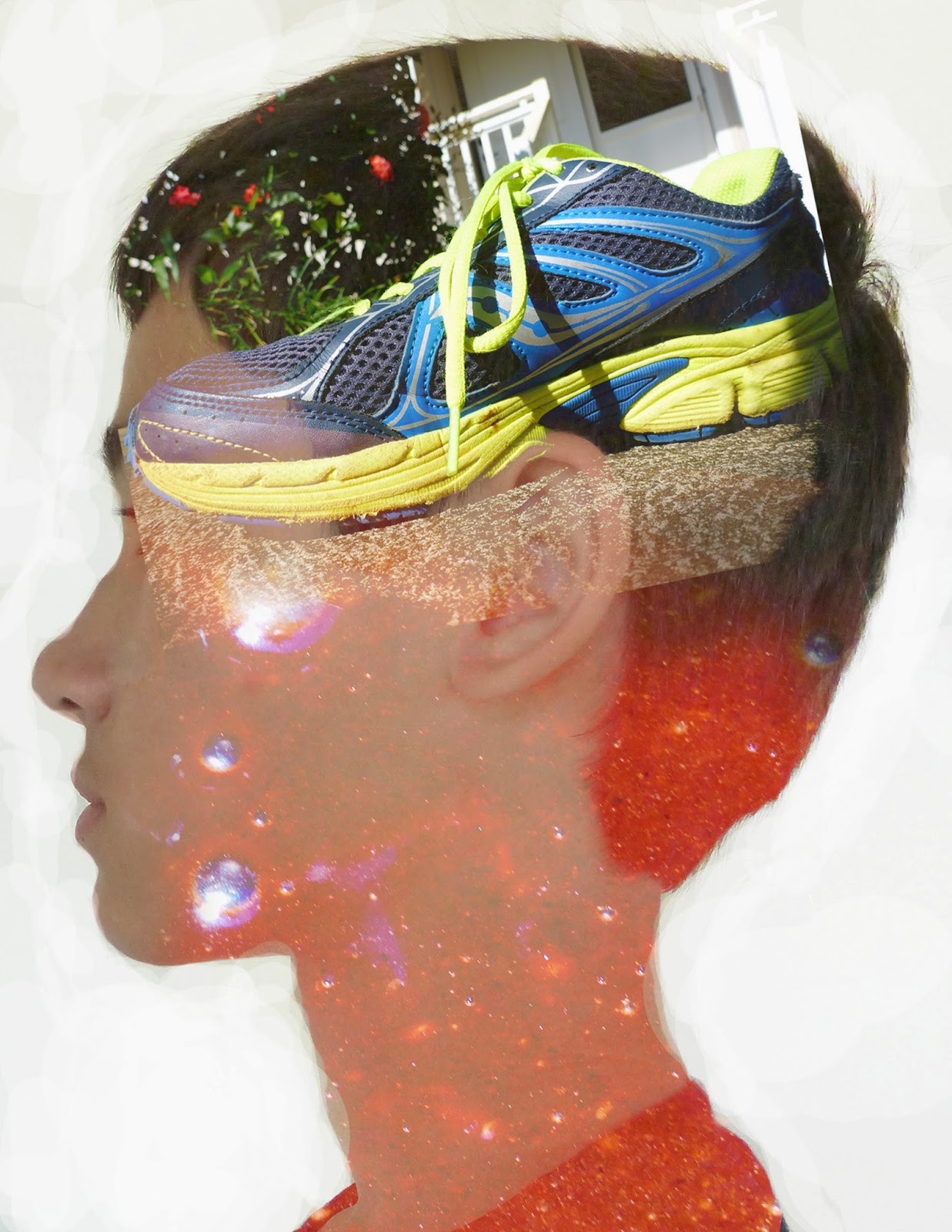
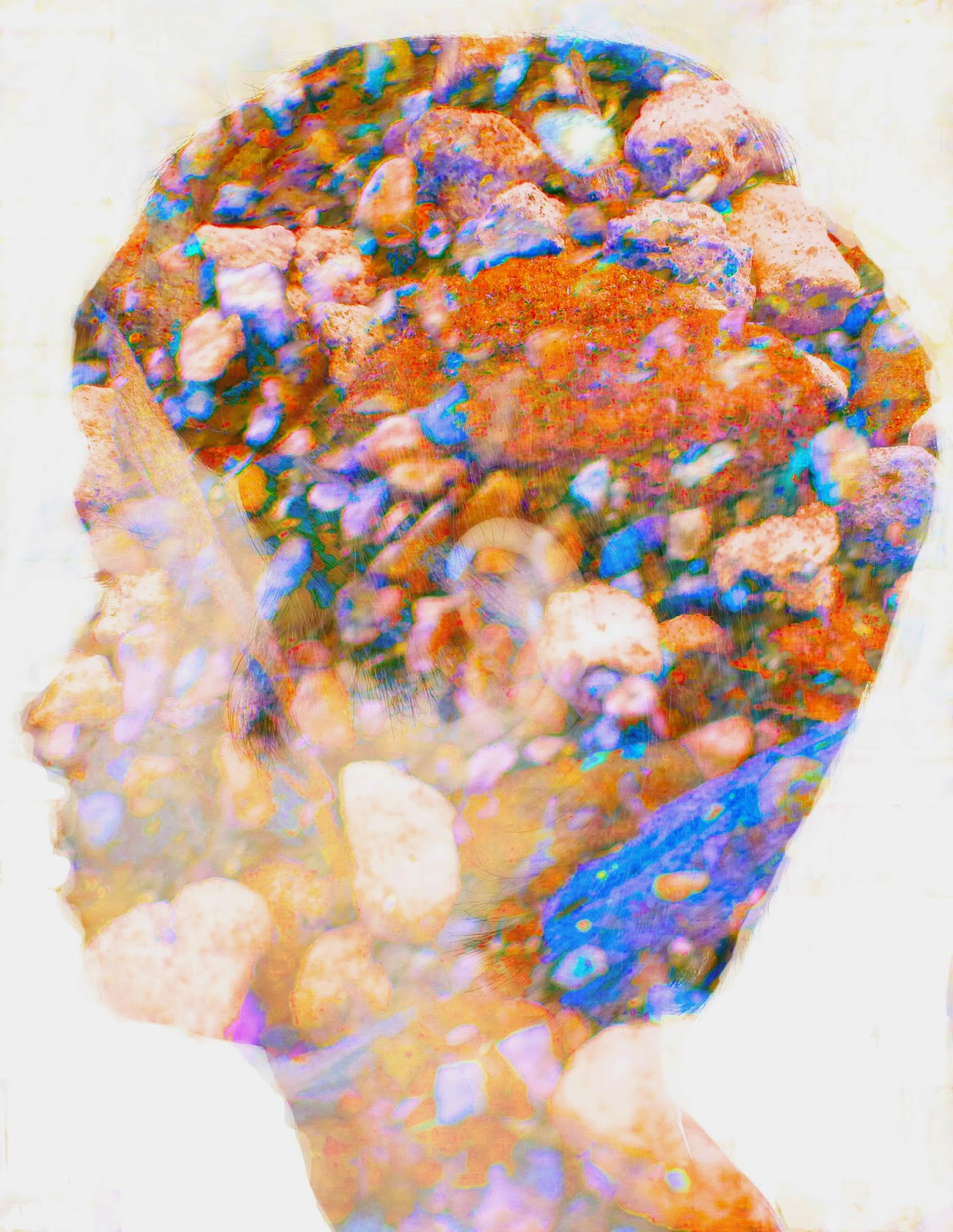
Double exposures are created in Photoshop by taking three images, two landscapes and one profile image. Once you have your images you take your profile image and bring it to the front of all your pictures, then take the dodge tool. What the Dodge Tool is is it lightens the image. You use the dodge tool to the make all the areas around your face completely white. Also the burn tool can darken the image (not an important fact but just good to know). The white space is called the negative space. Next you take all of your images, double click them and click screen mode. This will make all of your images see-through. Then (this is the fun part) you just mess around with adjustment layers make it look really colorful and beautiful or dark and depressing, or just explain who you are! Personally I liked the double exposed profile rather than the multi exposed profile because you get to be more abstract.
Personally my quality of work could have improved by a landslide. You can't very well see my second image and that second image is discolored! The second image I am talking about is not the shoe, but is the brownie mix. It was a very very difficult task to try to make the brownie mix visible because it is only one color and you really can only see the bubbles. These images represent me because I like running (that's the shoe) and I love cooking (the dreaded brownie mix). Also I was supposed to take a picture of the opposite side of my face yet somehow it turned up as the same side I was facing with my double. Wonder how that happened? I swore that was the opposite side of my face, oh well (Maybe my teacher wont notice, sssssshhhhhhh don't tell him). Anyway Here are my double and multi exposed portraits:
Double exposures are created in Photoshop by taking three images, two landscapes and one profile image. Once you have your images you take your profile image and bring it to the front of all your pictures, then take the dodge tool. What the Dodge Tool is is it lightens the image. You use the dodge tool to the make all the areas around your face completely white. Also the burn tool can darken the image (not an important fact but just good to know). The white space is called the negative space. Next you take all of your images, double click them and click screen mode. This will make all of your images see-through. Then (this is the fun part) you just mess around with adjustment layers make it look really colorful and beautiful or dark and depressing, or just explain who you are! Personally I liked the double exposed profile rather than the multi exposed profile because you get to be more abstract.
Multi Exposed |
Double Exposed |
Here is some pictures to help guide you:
Monday, February 9, 2015
HDR Photography
Experiment 1 |
Landscape |
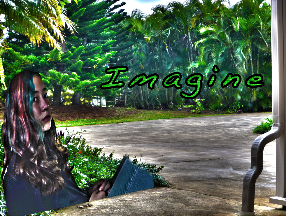
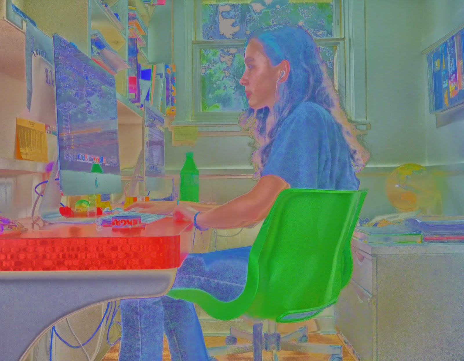
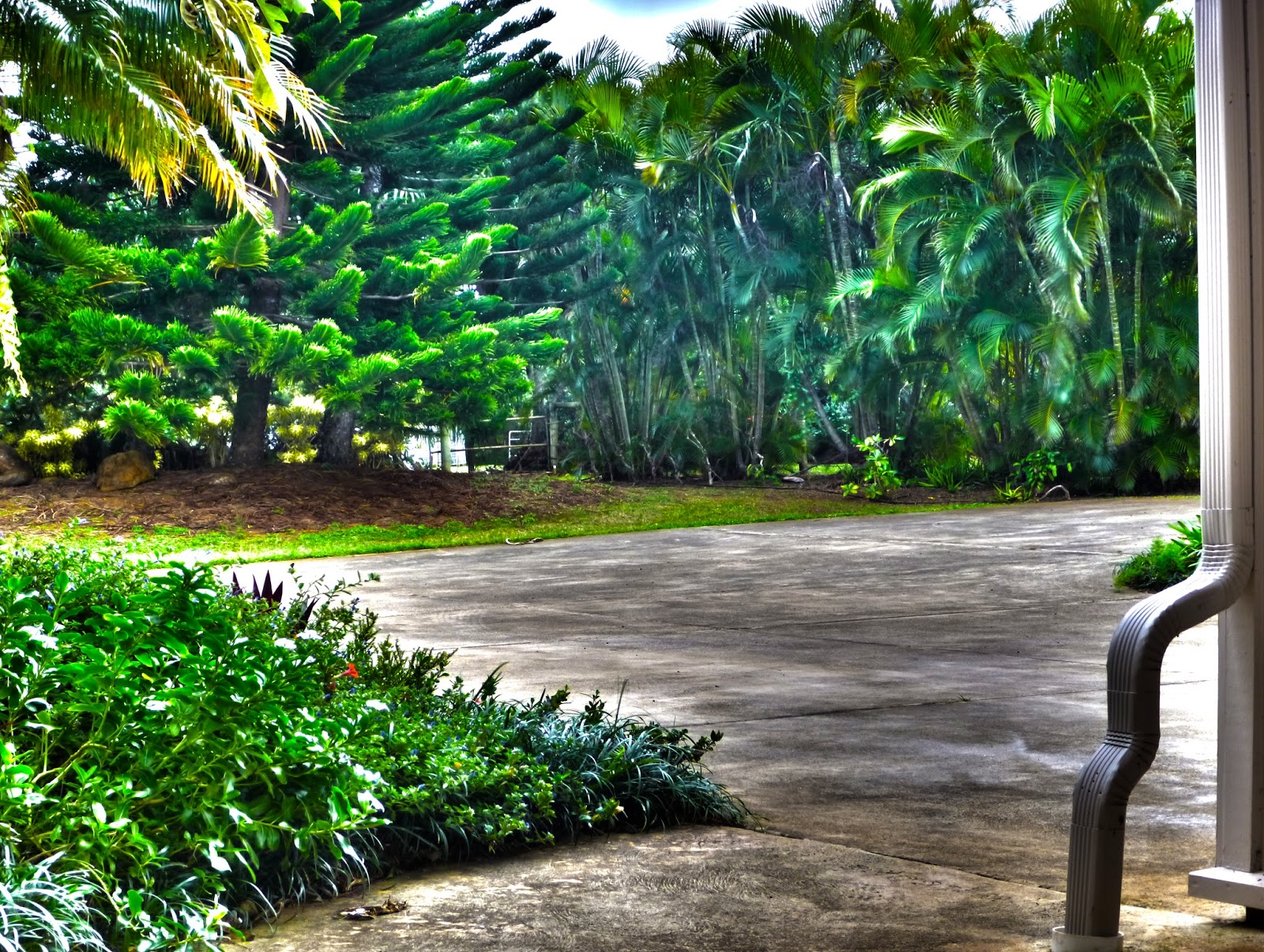
The thought that went into my superimpose, landscape and experiments was "hmm I want something unique and something colorful." So in my first experiment I did just that, colorful and unique. The reason I didn't use the first experiment was first of all because it got a three out of four out and secondly because on my superimpose it wouldn't work. Our teacher said that you can only have the person incorporated in the photo, and that would mean floating legs and weird hands. The step by step process that went into my pictures was that I want the rule of thirds, so I got my sister to get her eyes into the rule of thirds then I accidentally took a profile of her, and that is why I believe I got a three rather than a four on that project. The process behind the landscape was, that I wanted to do something different, so instead of grass I put concrete. On the landscape I forgot to put in rule of thirds though yet somehow rule of thirds found its way into m photo, happy accident.
Friday, January 30, 2015
1000 PAGE VIEWS
THANK YOU THANK YOU THANK YOU FOR 1000 PAGE VIEWS
HOPE YOU HAVE LIKED ALL OF MY BLOG POSTS I HAVE DONE SO FAR, COMMENT DOWN BELOW TO GIVE ME SOMETHING ELSE I CAN WORK ON!
Monday, January 26, 2015
Movie Trailer Critique
The next project that my class has completed was a movie trailer. In my movie trailer group there was Timothy Blum, Kalani Young and Cephas Woodward. We all pretty much worked together, we had fun, goofed around and got our work done. Kalani and Cephas were good for most of the time, but they needed to be told what to do and how to do it. And sometimes they would just play around instead of doing their work. I am a procrastinator but I care about my grade in this program, it is really fun and I do not want to get kicked out. When it got to the editing part we lost a bit of unison. What I mean by that is only tim and I started editing because Kalani would not show up, and Cephas would show up but not know what to do and leave. So it was up to me and tim to do all the editing. What I contributed to the script was part of the synopsis and the voice acting script, and some of the scenes. Our plan for our document was stressful though because it needed a lot of focus, which sadly was something we lacked.
The requirements for this project was to have one minute and thirty seconds minimum and two minutes and thirty seconds maximum of footage and your movie poster at the end. Also we needed to have in our movie trailer text layovers, five scenes, dialog and foley. What a foley is, is it's a sound that is used in some movies. For example in animated movies the foley makers are hard at work making all the foley's needed for it to be a successful movie, like if someone in the movie was falling maybe the foley makers are whistling and then drop a shoe to indicate that they fell. The movie poster at the end that we showed was tim's poster because we thought it was the best poster out of all of ours.
I agree with the results that my team got. We got all threes and some fours, which personally I thought the results would be lower but who am I to complain. We tried to fake the audience out by putting in some text layovers at the end, but in the end we didn't need them except we kept them in anyway. When it came down to the last day when we were almost done editing we realized, we only had four out of five scenes. Then we rushed to get by the last scene and it didn't completely make sense at first but if you followed the story you could kind of follow along. It wasn't the best movie trailer but we had a good time.
Subscribe to:
Posts (Atom)